
Every event has a morning routine. You open it, and before doing anything else you check the same handful of things: how many passes are still out, what’s waiting in your approvals or which teams are dragging their feet on forms.
Until now, the dashboard showed everyone the same screen. Your accreditation lead, your transport coordinator and whoever runs the guest list all landed on an identical page, then clicked away to find what they actually needed.
So we made it customisable. You can now arrange the dashboard per person and per event, so the first thing you see is the thing you came to check.
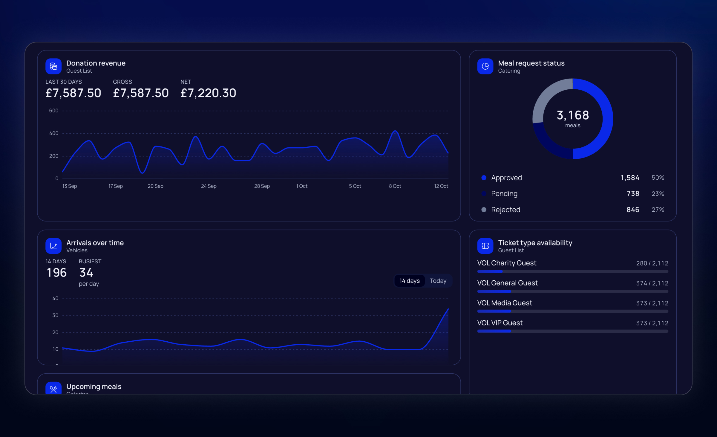
Make it yours
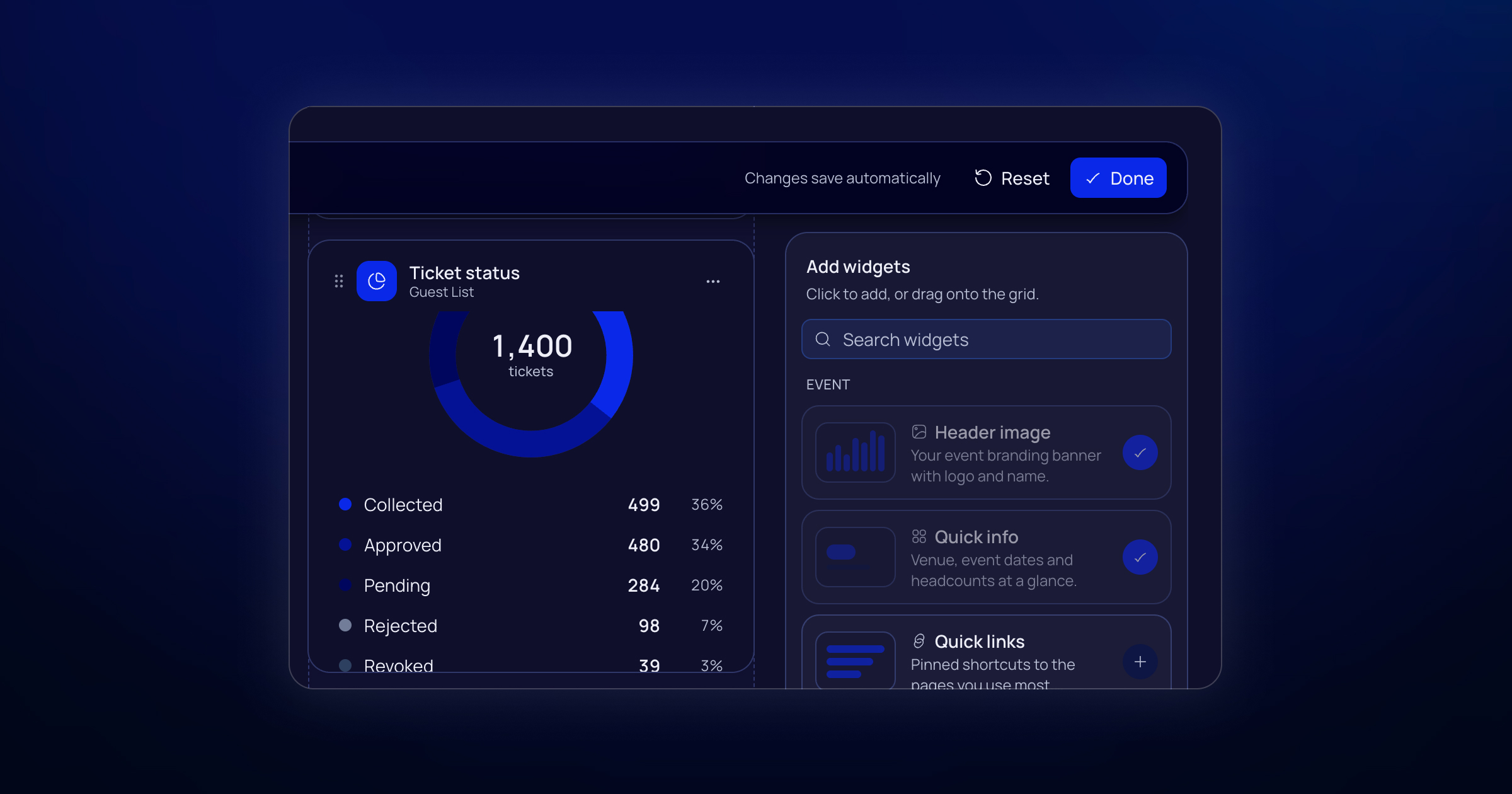
Hit Customise Dashboard and the dashboard becomes editable. Add widgets from the library, drag them where you want them, resize them, and remove anything you never look at.
Because layouts are per person and per event, your vehicle gate lead can fill their board with arrivals and check-ins without touching the one your accreditation team relies on.
What you can add
We have created plenty of widgets to choose from across all our modules, with some special widgets that are customisable or span multiple modules:
My inbox gathers every pass, guest and vehicle approval, plus documents waiting for review, into one list with the oldest at the top. If your day is mostly about clearing a queue, start here.
Teams lagging behind shows who has the most outstanding on forms, inductions, documents and pass collection. It’s handy when your job is chasing people rather than approving requests one by one.
KPI tiles give you one number and one trend each. Add a few and point each one at a different metric.
There’s plenty more. Catering, accommodation and documents each have their own widgets: upcoming meals, allocation usage, room block occupancy, deadlines and review queues. Guest list teams get ticket status, the funnel, approvals, availability, and donation revenue if you use it. Forms, inductions, news and recent activity are in there too.
If a module isn’t switched on for an event, or you don’t have access to it, its widgets stay locked.
Fine-tune each widget
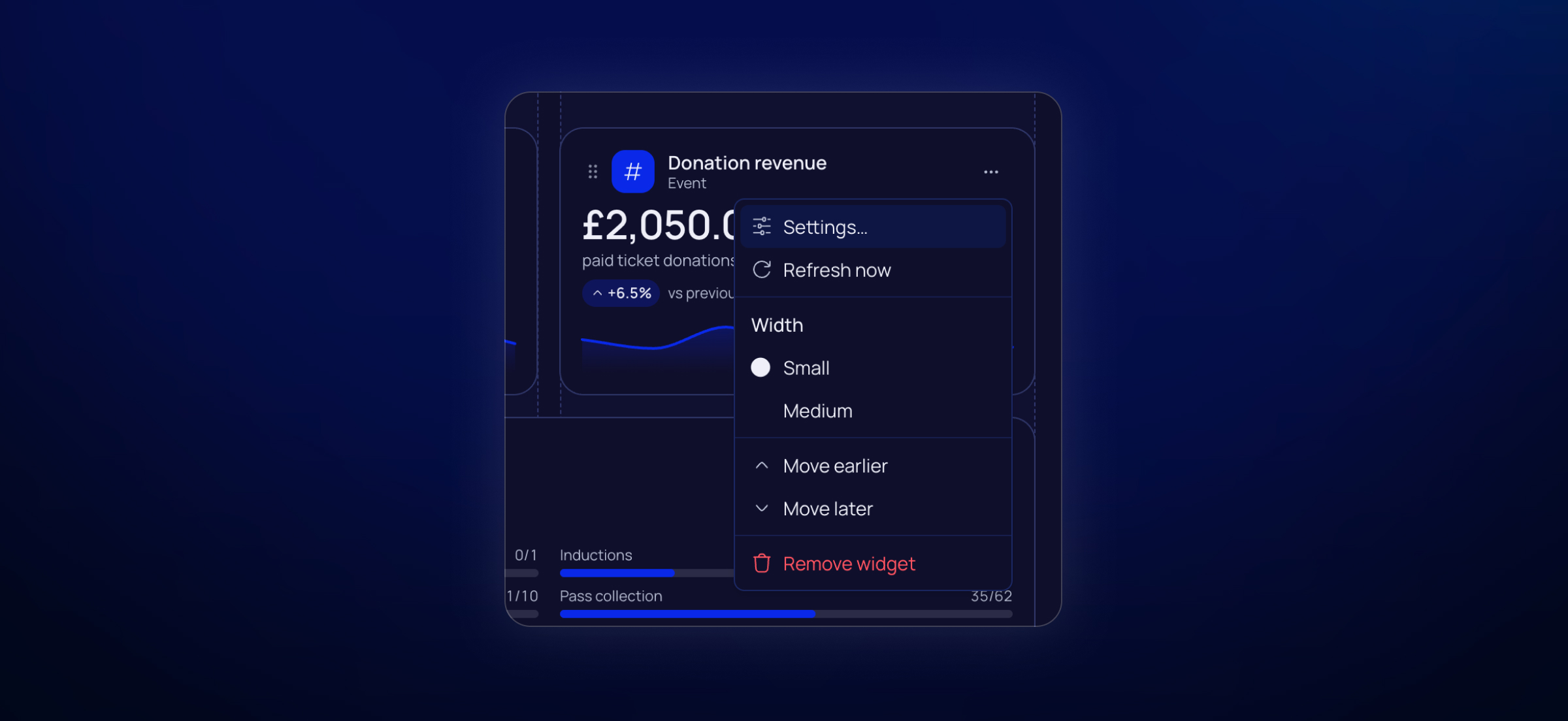
Many widgets have their own settings. You can pin up to six quick links, choose which metric a KPI tile tracks, or turn on previous-period comparison to see this week next to last. You can also filter an inbox or stock list so it doesn’t turn into a wall of rows.
The big advantage of our customisation options is that you can adapt while your event progresses: You might want to start with running accreditation by using inbox, pass collection, pass stock, teams lagging behind, a couple of KPI tiles, and quick links to approvals. Getting closer to show you can simply swap to what matters now, for example vehicle check-ins, zone access, meals or stays, and the document deadlines widget if paperwork is still trickling in.
Try it now
Open an event, hit Customise Dashboard on the bottom of the page. If there’s a widget you wish existed, tell us. We’re still adding to the library and want to hear what’s missing.